Differences between screens with 2 and 3 quadrants
Introduction
To facilitate understanding and standardize usage, system menus are divided into quadrants.
Most menus are displayed with two quadrants, with the possibility of adding a third quadrant when necessary, except for revision and revalidation menus, which always have three quadrants.
Menus with two quadrants are divided as follows:
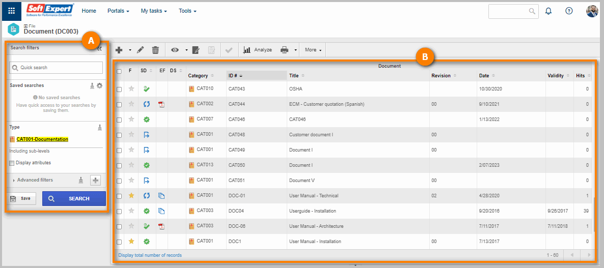
A The first quadrant displays the Search filters panel. It allows performing quick searches with the name and ID # of the records, as well as viewing records of a certain type and adding advanced filters.
B The second quadrant displays the list of records and the toolbar, which has buttons that allow executing actions for the record selected in the list.
To enable the third quadrant, simply click on the More option on the toolbar and select 3 quadrants, as displayed in the GIF below:
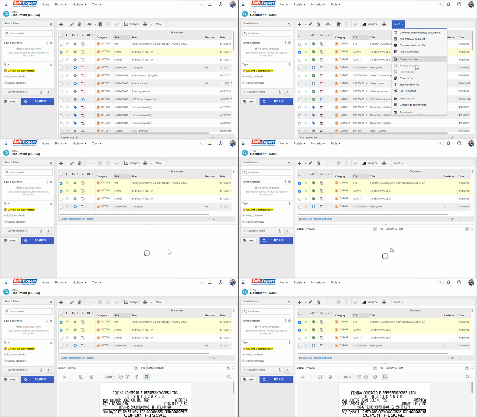
The third quadrant allows viewing details of the record selected in the list of the second quadrant.
To choose what to view, simply click on the arrow next to the Details field and select the desired option.
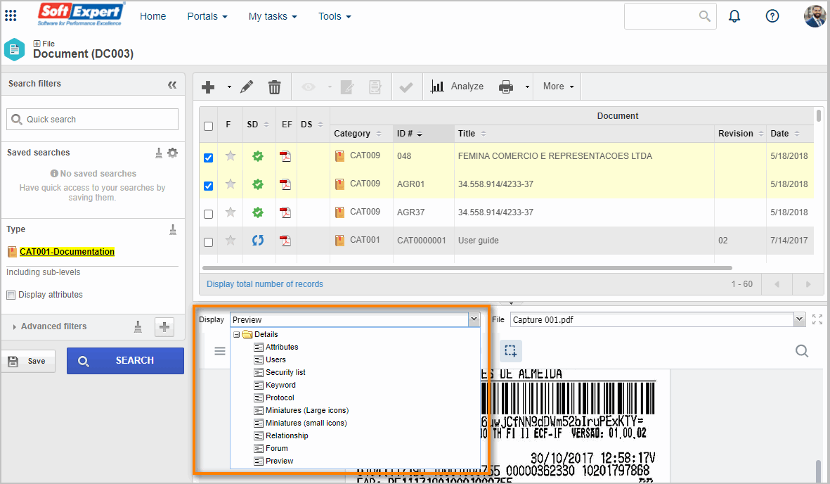
Detail options vary according to the menu.
Third quadrant in the Revision and Revalidation menus
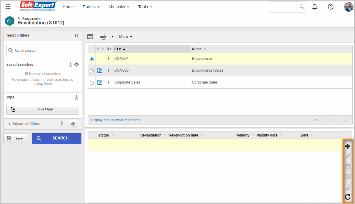
On the screens of the Revision and Revalidation menus, the third quadrant is fixed and displays information on the revision and revalidation histories of the record selected in the second quadrant.
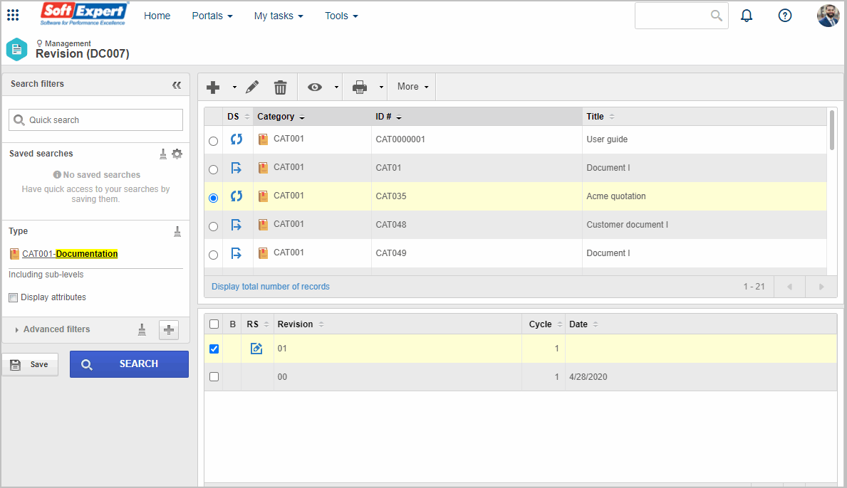
Moreover, on some screens of the Revalidation menu, certain options in the second quadrant toolbar are placed in the side toolbar of the third quadrant.
