SoftExpert Kanban widgets
Prerequisite
- Access to the SoftExpert Suite portal.
Introduction
The Kanban widgets aim to help users by providing a graphical view of the Kanban metrics. SoftExpert Kanban has the following widgets available:
Cumulative flow diagram
This diagram, also known as CFD, has as main objective to show the stability of your flow.
The strips of different colors that divide the sections represent the different stages of your workflow. The distance between the lines of a CFD will show the issues your workflow has.

Burndown chart
This is a Scrum chart that allows checking if the work is going according to plan in the sprint.
It is composed of two axes: The vertical one, which will represent the work that needs to be done; and the Horizontal one, which presents the time for the assignment to be completed.
It is represented by two lines:
- Ideal-work line: connects the starting point to the end point of the work, showing the sum of estimates for all tasks that need to be finished.
- Actual-work line: presents the actual work.
At the beginning, the remaining work of both lines will be equal, but, as the sprint moves forward, the actual-work line floats above and below the ideal-work line.

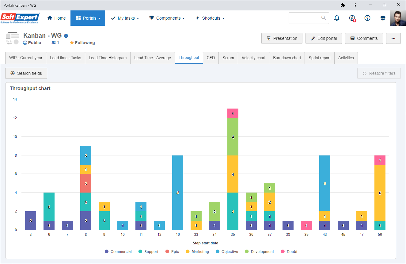
Throughput chart
The Throughput chart shows the number of cards belonging to a Kanban board that are delivered in a certain period, that is, it is a metric that determines a team's workflow processing capacity.
We recommend analyzing the period comprising the last 8 weeks, at most.
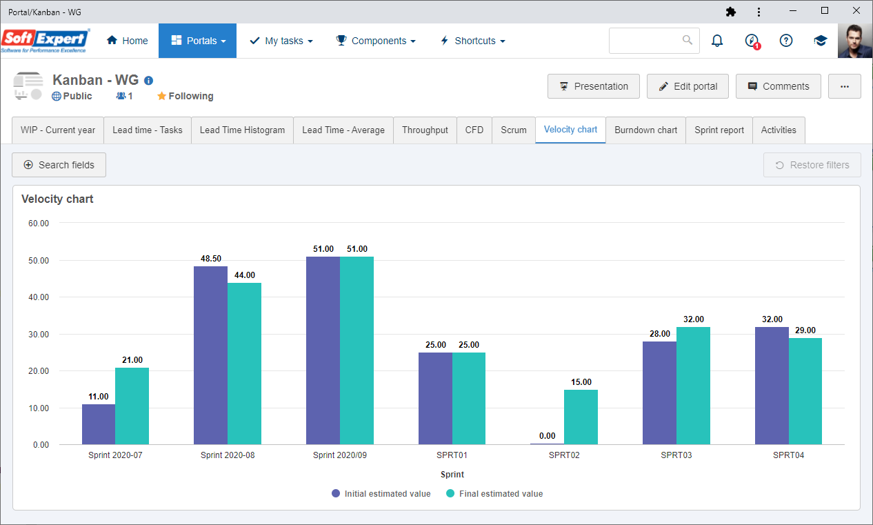
Velocity chart
Allows comparing the planned estimates with the actual estimates of the team's sprints.
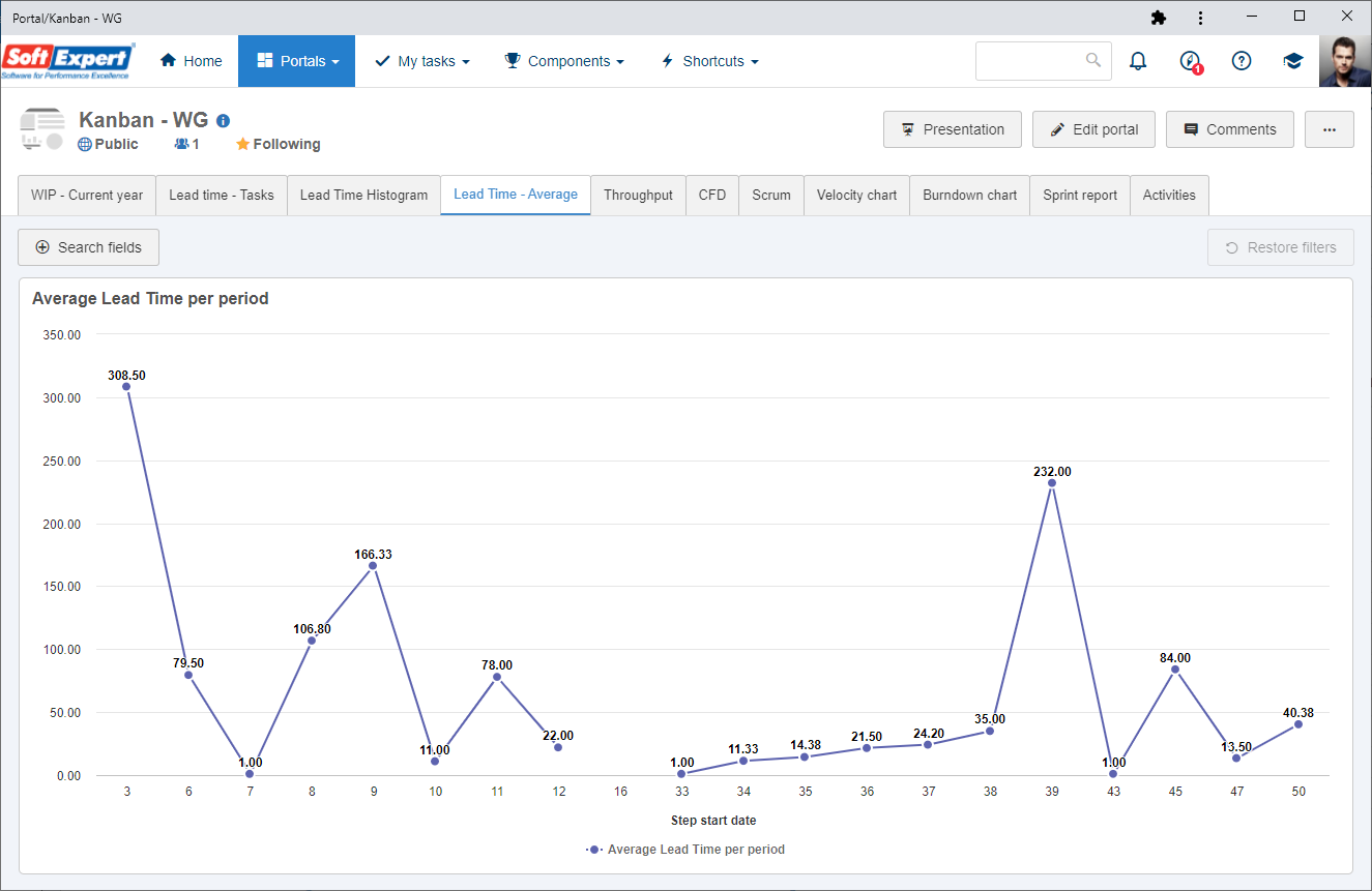
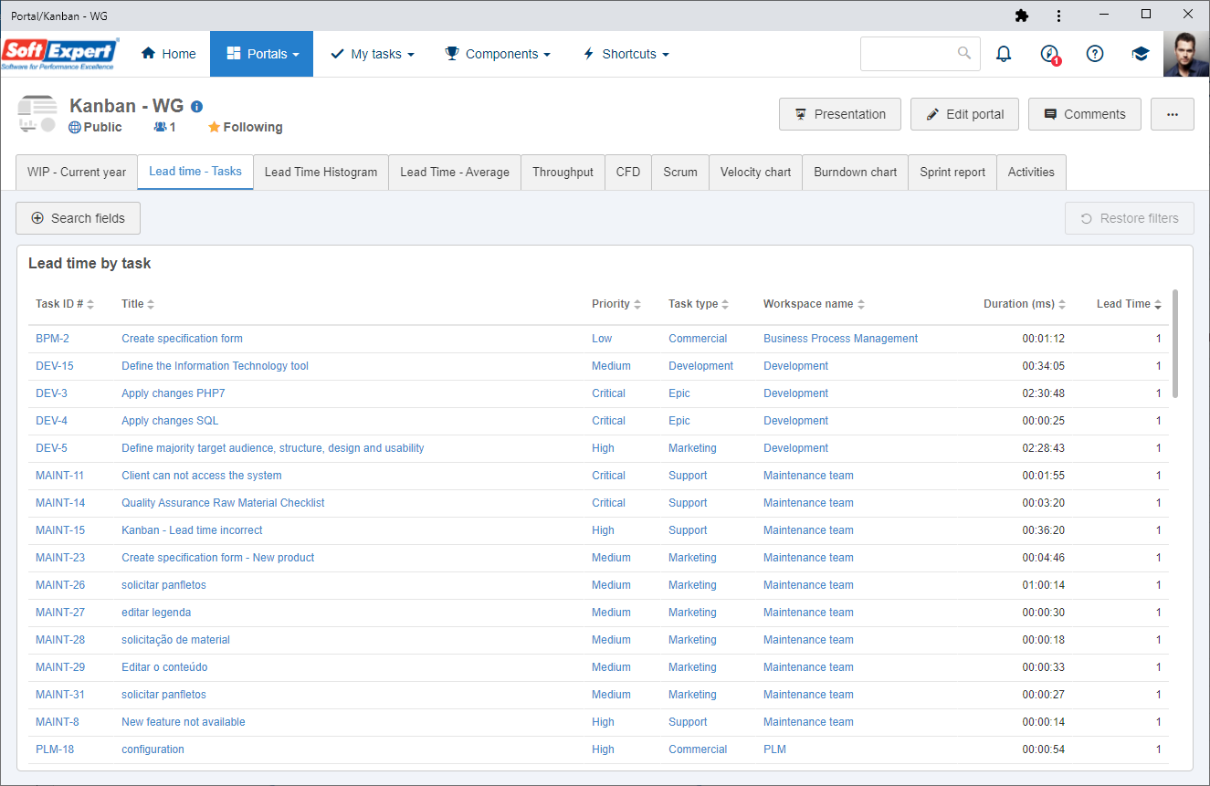
Lead time
The lead time considers how much time a card remains in the board until completion. Its objective is to take into account the customer's perception about the response time of the team.
Teams with shorter lead times respond better to changes.
The widgets that allow seeing this metric graphically are:
Lead Time histogram
The sprint histogram allows comparing the lead time month by month. For example:

Average Lead Time per period
This chart allows analyzing the lead time within a certain period. For example:
Lead Time by task
This chart allows analyzing the lead time of a certain task:
Sprint report
It must be used only if the workspace is set by Sprint; it displays information on the operations, tasks, estimates, etc., of each workspace sprint.

Applying widgets
For a better experience with the charts, we recommend always applying the filter by workspace so that only the data referring to that specific workspace is listed, thus improving the possibility of performing the desired analyses.